JM Wall - Responsive Theme for Fashion store
Responsive Magento theme has all the fancy big fon
- Created: 01/05/2013
- latest Update: 05/09/2013
- By: JoomlArt
Introduction
When you download templates from the JM Magento download section, you will get a zipped file. Once unzipped, you will see following folders:
- Documentation : contains userguide
- Extensions: contains all extensions built in the template
- Quickstart: is a full Magento CMS version with our template already integrated to match demo
- Theme : contains the template files only
- PSD : contains all source files of the theme
The use of these
folders is clarified in the section “INSTALLATION
GUIDE” below.
INSTALLATION GUIDE
There are two ways to install a
JoomlArt Magento template:
- Theme and Extensions installation
- Quickstart Installation
Template and
Extension installation: Applicable when you have
already installed a Magento instance on your server. You
will need only be using the zipped files in “Extensions” and
“Theme” folders mentioned above.
Quickstart installation:
Applicable when you need a fresh Magento with our template
built in as per our demo. The zipped file in “Quickstart”
folder is sufficient to fulfill the Quickstart installation.
2.1 Template and Extensions
installation
Please follow below instruction
about how to install template and extensions
How to install Magento theme guide
How to install Magento
extension guide
After installing the template and extensions, your
front-page seems corrupt not like what you see on our demo,
you need to come back making a site like demo guide
to get things in neat layout as per our demo.
2.2 Quickstart Installation
Please follow below instruction
about how to install Quickstart package
How to install Magento
Quickstart package
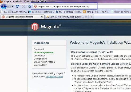
Magento Theme Installation Guide
Please make sure your
Magento store comes ready before you integrate our themes.
If your store has not been available yet, get it quickly
following Magento Installation
Guide
The installation of our theme is
quite simple. You just need follow steps below to get our
theme ready for your Magento store:
- Upload folders skin and app from
our download package to your Web server's document root
(from here on, referenced as {docroot}). These
files will overwrite default folders skin and app in
your Magento folder, you should see a directory layout
like this:
{docroot} /magento/app/
index.php
js/
lib/
LICENSE.txt
media/
pear/
skin/
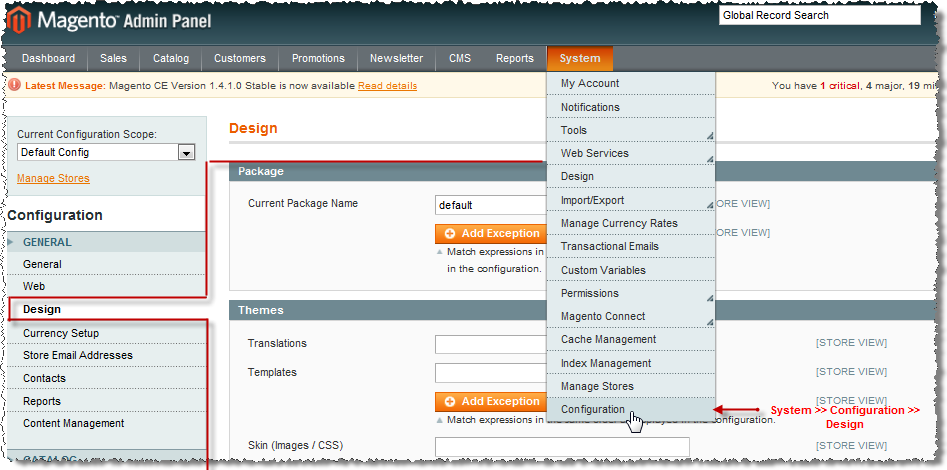
var/ - Login your Magento Admin area (ex: access Magento Admin area on a stage localhost: http://localhost/magento/index.php/admin/)
- Navigate to
System>Configuration>Design as per screenshort below
(Suppose that you are installing our Magento template JM
Purity, follow steps below to see how to configure. For
other template (i.e. jm_newtheme), you just
simply replace text jm_purity with jm_newtheme)

- Fill texts to the "Package" and
"Themes" sections as per screenshorts below:
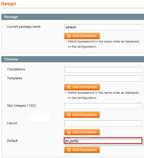
- Click button "Save Config" to save your configuration
Magento Extension Installation
Please make sure your
Magento store comes ready before you integrate our
extensions. If your store has not been available yet, get it
quickly following Magento Installation
Guide
You just need follow steps below
to get our extensions ready for your Magento store:
- Upload folders skin and app from
our download package to your Web server's document root
(from here on, referenced as {docroot}). These
files will overwrite default folders skin and app in
your Magento folder, you should see a directory layout
like this:
{docroot} /magento/app/
index.php
js/
lib/
LICENSE.txt
media/
pear/
skin/
var/ - Login your Magento Admin area (ex: access Magento Admin area on a stage localhost: http://localhost/magento/index.php/admin/)
- Navigate to
System>Configuration
- You will see installed extension, click extension's name tab to go to extension configuration page.
Magento Quickstart Installation
JoomlArt provides JM
Quickstart package for each template which aims to ease the
installation for users. It will help you save much time of
installing and configuring if you plan to start your site
from the beginning.
Please follow steps below:
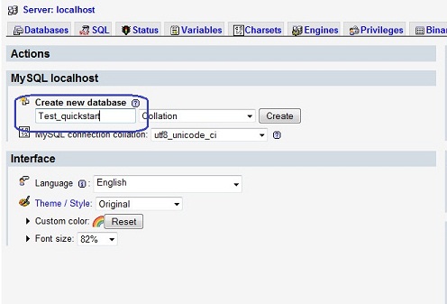
- Download the quickstart package
- Extract and Upload the whole Quickstart package to your server. In Quickstart folder you will see the extracted folder that include all sample data
- Create a database for your
Magento (using phpmyadmin)
- Start installation by opening
browser and navigate to your url (where the quickstart
uploaded) to load default Magento installer.
- Finish installation
Important notes:
- Do not use "localhost" in URL,
otherwise you could not log in your admin (you should use
your local IP if installing on your computer.).
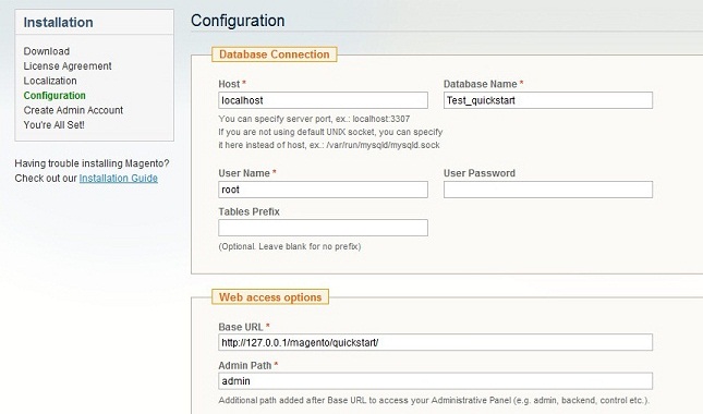
- At step 3 of installation - Configuration page: Leave "Tables prefix" blank
iPhone + Handheld device setting for Magento Theme
Theme Configuration:
Login your Magento Admin area
(ex: access Magento Admin area on a stage localhost: http://localhost/magento/index.php/admin/)
Navigate to System>Configuration>Design as
per screenshot below:
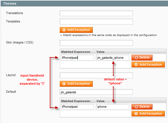
Screenshots of JM Galaxite
layout in iphone.
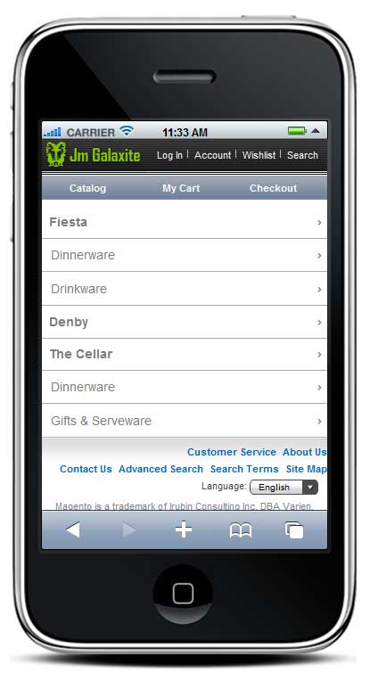
Landing page (above)
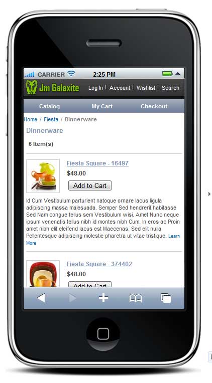
List View (above)
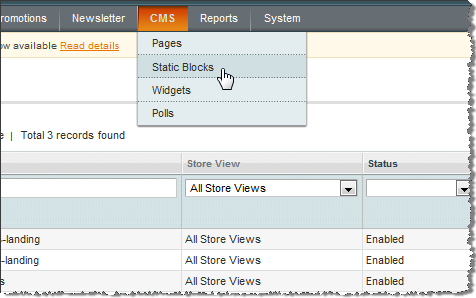
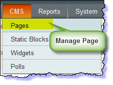
How to Create static Block
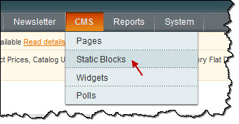
Go to Magento
Admin Panel >> CMS >> Static
Blocks:
Create block: E.g create "Did
you know?" block
- Navigate to "CMS->Static
Blocks"
- Click "Add new Block"
- Fill the form and configure
with text in italic below and click "Save Block" button:
- Title: Right module
- Identifier: right_block
- Store View: All Store Views
- Status: Enable
- Content: fill in all syntax quoted as you would like.
- Go to CMS > Static Block > Click on the Homepage (home) row to edit the current homepage.
- In "General Information" tab, fill "Content" field with syntax quoted.
- To push new static block, fill in "Layout Update XML" field in Design tab with syntax quoted below for example:
<reference name="right">
            <block type="cms/block" name="jmtabs" before="-">
                <action method="staticblock">
                    <title>[B][COLOR=Red]New block[/COLOR][/B]</title>
                    <identifier>[B][COLOR=Red]new_block[/COLOR][/B]</identifier>
                </action>
            </block>
</reference>
Refresh your cache if needed (in System > Cache Management > Save cache settings). Refresh your homepage to see the change applied.
Layout and Block positions
General configuration
How to install
- If you are new to JoomlArt's Magento theme, it is helpful to look at the Magento general guideline for basic understanding foundation before start off with the installation.
- If you do not wish to use our Quickstart package for installation, the below guideline is not applicable for you. Learn how to install Quickstart HERE
WHAT ARE THE STEPS?
- You will need your Magento CMS installed first before proceeding to installing Magento theme. If you haven't had that installed yet, take a bit time to read the How-to @ Magento Installation Guide
- Install the JM Siotis theme (Not familiar How-to? Check out the Theme installation guide)
- Install the built-in extensions for JM Siotis. (How-to guide is @ Magento Extension installation guide)
- Configure your theme for iPhone + Handheld device setting for Magento Theme
- Last but not least, know the: Extension & Static Block Position
List of built-in Extensions for JM Wall:
- JM Products Extension
- JM Slideshow Extension
- JM Mega Menu Extension
How to configure blocks
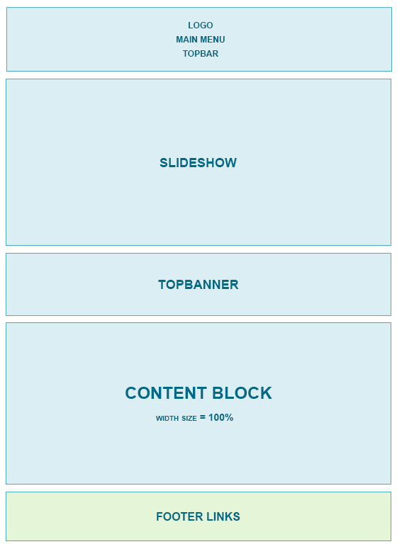
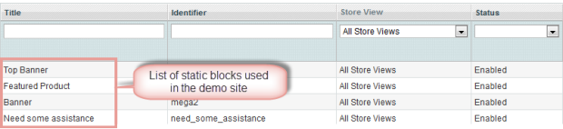
The JM Wall front-page uses 4 static blocks on Theme:
- topbanner
- mega1
- mega2
- need_some_assistance
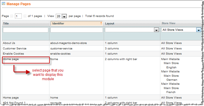
To create these blocks, go to CMS > Static Block >and select the page that you want to display this block on (e.g: Home page) :
You can add a new block by click on Add New Block button to create new block and input the content of this block as you need. Please see How to create New Static Block.
1.Top banner:
Backend settings as
in Demo
HTML code
- <div class="block block-banner">
- <div class="block-content">
- <ul class="clearfix">
- <li class="banner first"><a href="#"><img src="{{media url="wysiwyg/banner4.jpg"}}" alt="" /></a></li>
- <li class="banner"><a href="#"><img src="{{media url="wysiwyg/banner2.jpg"}}" alt="" /></a></li>
- <li class="banner last"><a href="#"><img src="{{media url="wysiwyg/banner3.jpg"}}" alt="" /></a></li>
- </ul>
- </div>
- </div>
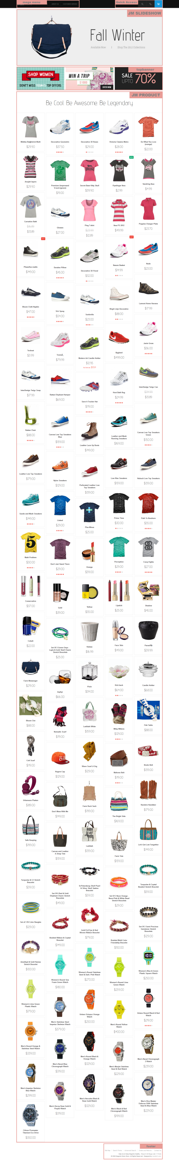
Front-end
Appearance

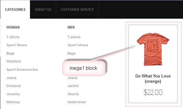
2. Mega1 - Feature Product:
This block
is displayed at the Mega Menu Extension of JM Wall
Backend settings as
in Demo
- <p>{{block type="joomlart_jmproducts/list" name="home.jmproducts.list" template="joomlart/jmproducts/oneproduct.phtml" quanlity="1" title="" catsid="23" max="0" }}</p>
Front-end Appearance
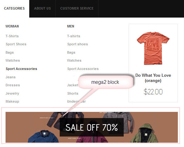
3. Mega2- Banner:
Backend settings as
in Demo
- <div class="block"><a title="" href="#"><img src="{{media url="wysiwyg/banner1.jpg"}}" alt="" /></a></div>
Front-end
Appearance
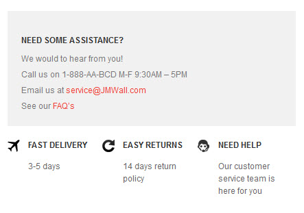
4 Need_some_assistance - Need some assistance
Backend settings as in Demo
<div class="need_some_assistance"><a title="" href="#"><img src="{{media url="wysiwyg/banner-free.jpg"}}" alt="" /></a>
<ul class="clearfix">
<li class="fast-delivery">
<h2>Fast Delivery</h2>
<p>3-5 days</p>
</li>
<li class="easy-returns">
<h2>Easy returns</h2>
<p>14 days return policy</p>
</li>
<li class="need-help">
<h2>Need Help</h2>
<p>Our customer service team is here for you</p>
</li>
</ul>
</div>
Front-end
Appearance
How to configure extentions
1. JM Product Extension
To push this extension into front page like our demo site, go to CMS > Pages:
Then click on Homepage >> Design Tab
and fill parameter with syntax below:
   <block
            type="joomlart_jmproducts/list"
            name="home.jmproducts.list"
            template="joomlart/jmproducts/list.phtml"  >


            <block type="catalog/product_list_toolbar"
            name="product_list_toolbar"
            template="catalog/product/list/toolbar.phtml">


            <block type="page/html_pager"
            name="product_list_toolbar_pager"/>


            </block>

                    <action
method="setToolbarBlockName"><name>product_list_toolbar</name></action>

               </block>

            </reference>
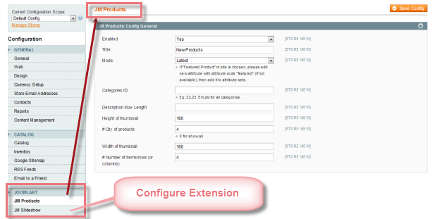
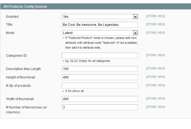
Navigate to System>Configuration>JM Products and configure default criteria as in the screen-short below for JM Product:
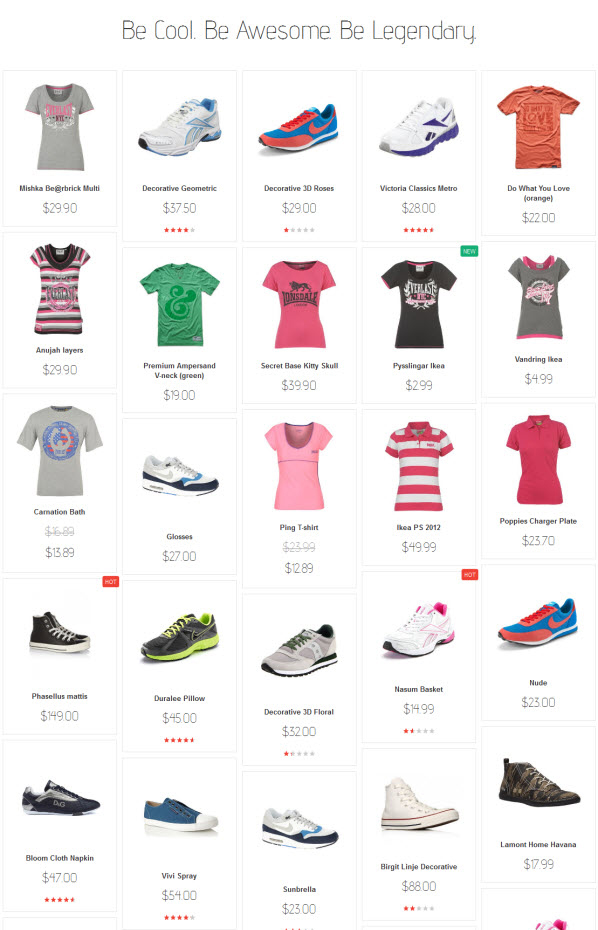
Front-end Appearance
2. JM Slideshow Extension
Navigate to System>Configuration>JM Slideshow and configure default criteria as per screen-short below:
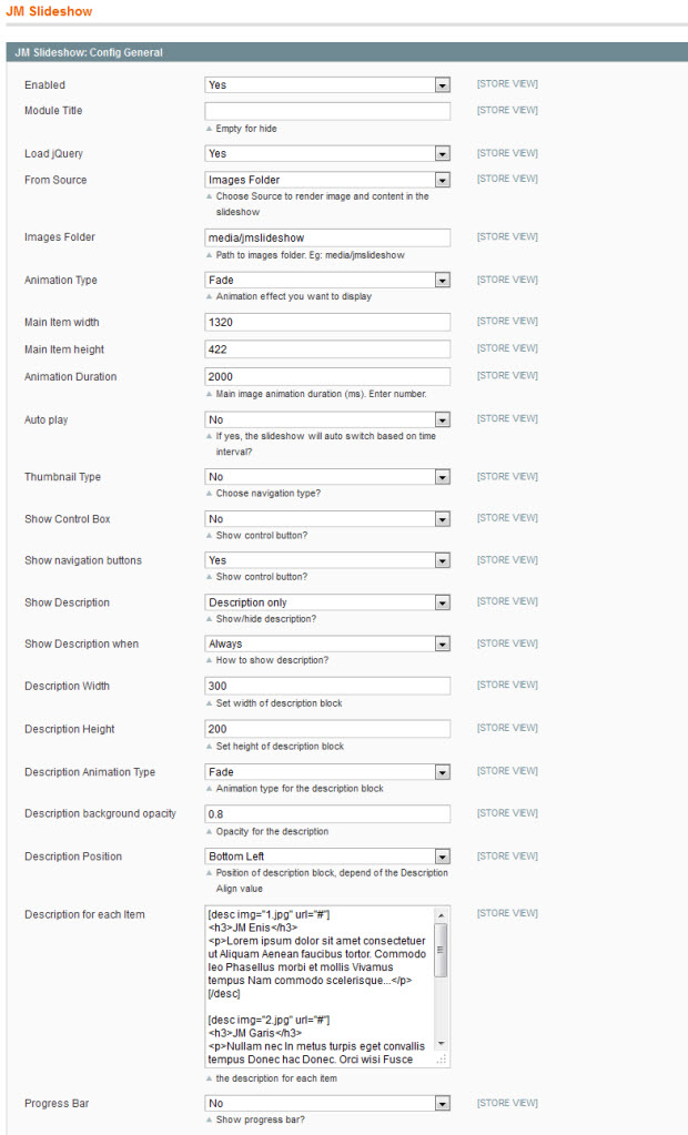
Update this
code at Description with HTML Code:
[desc img="1.jpg" url="#"]
<h3>JM Enis</h3>
<p>Lorem ipsum dolor sit
amet consectetuer ut Aliquam Aenean faucibus tortor. Commodo
leo Phasellus morbi et mollis Vivamus tempus Nam commodo
scelerisque...</p>
[/desc]
[desc img="2.jpg" url="#"]
<h3>JM Garis</h3>
<p>Nullam nec In metus
turpis eget convallis tempus Donec hac Donec. Orci wisi
Fusce consectetuer quis sem et est dui...</p>
[/desc]
[desc img="3.jpg" url="#"]
<h3>JM Bistro</h3>
<p>At et id justo accumsan
Donec a odio nibh id et. Quisque nunc nibh sit pretium
turpis eget sed non Proin non. Justo id pede Vestibulum
ornare Phasellus egestas.</p>
[/desc]
To push this extension onto front page on top, go to CMS > Pages >> Homepage >> In Design tab, please fill in Layout Update XML parameter as below :
<reference name="mass-top">


                <block
            type="joomlart_jmslideshow/list" name="jmslideshow"
            template="joomlart/jmslideshow/list.phtml" />

                   <block
            type="cms/block" name="topbanner">

                    <action
method="setBlockId"><block_id>topbanner</block_id></action>

                </block>

            </reference>
Front-end
Appearance

How to configure Mega Menu
JM Wall
site uses Mega Menu. Follow the guide below to create menu.
To add menu items, please
navigate backend >> JM Mega
Menu >> Manage Menu Item
1. Categories Menu
Front-end
appreance
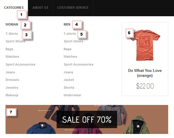
Main Menu Items (parent & child) backend settings as below
- Item 1: Categories - Menu Backend Settings
- Item 2: Woman - Menu Backend Settings
- Item 3: T-Shirts - Menu Backend Settings
- Item 4: Men - Menu Backend Settings
- Item 5: T-Shirts - Menu Backend Settings
- Item 6: Mega Extension - Menu Backend Settings
- Item 7: Banner - Menu Backend Settings
Note: Other sub-menus are created like T-Shirts menu
2. About Us Menu
Backend-settings
Front-end appreance:

3. Customer Service Menu
Backend-settings
Front-end appreance:

How to Configure Pages
1.Home page
To config this page, please navigate to CMS >> Pages, then select Home with title " JM Wall - Responsive Magento theme for blogging, ecommerce, business, portfolio site." to update the settings as below:
- Page Information Tab: Backend Settings
- Design Tab: Backend Settings
Paste the code below on Layout Update XML field:
<reference name="mass-top">
<block type="joomlart_jmslideshow/list" name="jmslideshow" template="joomlart/jmslideshow/list.phtml" />
<block type="cms/block" name="topbanner">
<action method="setBlockId"><block_id>topbanner</block_id></action>
</block>
</reference>
<reference name="content">
<block type="joomlart_jmproducts/list" name="home.jmproducts.list" template="joomlart/jmproducts/list.phtml" >
<block type="catalog/product_list_toolbar" name="product_list_toolbar" template="catalog/product/list/toolbar.phtml">
<block type="page/html_pager" name="product_list_toolbar_pager"/>
</block>
<action method="setToolbarBlockName"><name>product_list_toolbar</name></action>
</block>
</reference>
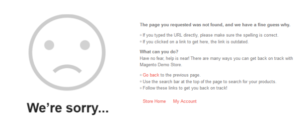
2.404 Not Found page
To config this page, please
navigate to CMS >> Pages, then
select 404 Not Found 1 page to update the
settings as below:
- Page Information Tab: Backend Settings
- Content Tab: Backend
Settings
Paste the code below on Content field:
HTML Code:
<div id="jm-error"><dl><dt>The page you
requested was not found, and we have a fine guess
why.</dt><dd>
<ul class="disc">
<li>If you typed the URL directly, please make sure the
spelling is correct.</li>
<li>If you clicked on a link to get here, the link is
outdated.</li>
</ul>
</dd></dl><dl><dt>What can you
do?</dt><dd>Have no fear, help is near! There are
many ways you can get back on track with Magento Demo
Store.</dd><dd>
<ul class="disc">
<li><a onclick="history.go(-1);" href="#">Go
back</a> to the previous page.</li>
<li>Use the search bar at the top of the page to search
for your products.</li>
<li>Follow these links to get you back on track!<br
/><br /><a style="margin-right: 20px;"
href="{{store url=""}}">Store Home</a><a
href="{{store url="customer/account"}}">My
Account</a></li>
</ul>
</dd></dl></div>
- Design Tab: Backend Settings
- Meta Data Tab: Backend Settings
Frontend appearance:
How Configure Responsive
We are proud to tell that JM Wall theme for Magento supports Responsive design. Meanwhile, this theme will fit screens of various devices (mobiles and tablets)
1. Supported Layouts
All the
style files supported layouts are located in the
folder: skin/frontend/default/jm_wall/css
In this theme, we support 3
styles: layout in PC, tablet and mobile
( default theme of Magento only. It will upgrade in the
next version) .
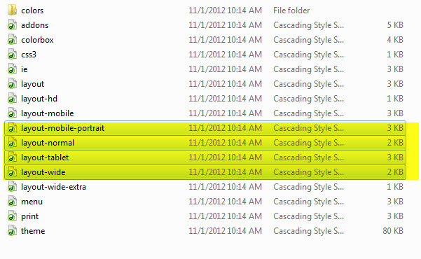
When you have style files, we need to define it in the page.xml file
located in: app/design/frontend/default/jm_wall/layout
Open file layout.xml
At the tag in this file, add this code:
-
<action method="addCss"><stylesheet>css/layout-mobile.css</stylesheet><params>media="only screen and (max-width:719px)"</params></action> -
<action method="addCss"><stylesheet>css/layout-mobile-portrait.css</stylesheet><params>media="only screen and (max-width:479px)"</params></action> -
<action method="addCss"><stylesheet>css/layout-tablet.css</stylesheet><params>media="only screen and (min-width:720px) and (max-width: 985px)"</params></action> -
<action method="addCss"><stylesheet>css/layout-normal.css</stylesheet><params>media="only screen and (min-width:986px) and (max-width: 1235px)"</params></action> -
<action method="addCss"><stylesheet>css/layout-wide.css</stylesheet><params>media="only screen and (min-width:1236px) and (max-width: 1585px)"</params></action> -
<action method="addCss"><stylesheet>css/layout-wide-extra.css</stylesheet><params>media="only screen and (min-width:1586px) and (max-width: 1890px)"</params></action> -
<action method="addCss"><stylesheet>css/layout-hd.css</stylesheet><params>media="only screen and (min-width:1891px)"</params></action>
- As can be seen, when the screen width is between 479 and 1891 pixel, the themes loads file layout-tablet.css to display as the default style file.
- When the screen width is smaller than 479 pixel, the theme loads file layout-mobile.css to display as the default style file.
- Otherwise, the theme will load the file layout.css to display as its default style file. The layout.css file is the style file for PC.
2. How to define Responsive
In summary, the base of responsive is column.
- The layout in PC uses 1 columns, the width size of layout is 100% --> width size of each column = 50%. Then every time screen width in pixel changes, the width of each column in pixel is also changes.
- Tablet Layout uses 1columns, each column width is 50%.
- Mobile Layout uses 1 columns, each column width is 100%.
2.1 Layout in demo